Product designers often have the challenge of making it easy, simple and fun for users to use their product. This usually includes moving the mouse over things and clicking them. You may be surprised that for many people the task of moving the mouse to a specific location (e.g. a button) and clicking it is not trivial and may take several seconds.
Common product management knowledge dictates that there are 5 points on the screen that are of infinite size, and are thus infinitely easy to “reach” or click. The first 4 are the 4 corners of the screen – just pull your mouse to one of them, and you’ll surely reach it1. For example, Microsoft uses these 4 points well (at least starting with Windows 7 and Office 2007, and assuming you’re working with a maximized window):
- Top left: Office button, leading to Save/Print/etc2
- Top right: close the current maximized window3
- Bottom right: show desktop
- Bottom left: Open the “Start Menu”.
But the most interesting and challenging point of infinity is the 5th one, which is where your mouse cursor is currently located. Bringing the choice to the user’s mouse cursor may be the easiest thing of all, but if you don’t use it wisely, you can end up with horrible designs where buttons are chasing the mouse, etc4. The potential of the fifth point is huge, but using it properly is an art. As a product manager/designer, even if you don’t use it, you must be aware of it and constantly ask yourself where the user’s mouse cursor is currently located, whether it’s good or bad, and what you can do about it.
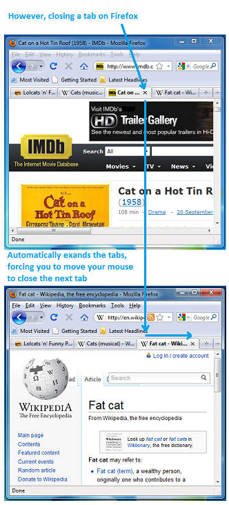
One example that pisses me off with Firefox is their implementation of dynamic-size tab headers. Let me explain. When you open 2-3 tabs in a modern browser, there’s some constant width to the tab headers. But when you open more than what fits the screen width, tab headers begin to shrink, so that more fit in. That’s good design.
In both Chrome and Firefox, you can close any open tab, regardless of whether it’s the tab you’re currently viewing5. To close a tab, you simply click the small [x] on the tab header. The difference starts at what happens next.
Google are executing perfectly here, keeping the same (shrunk) tab sizes, and bringing the [x] button of the next tab to exactly where your mouse cursor is. To close several adjacent tabs, simply click several times – no need to move the mouse. Chrome keeps the tab widths that way as long as your mouse is on the [x] button of the next tab. Once you move the mouse outside the range of the [x] button, the tabs grow to fit the width of the screen.
Firefox, on the other hand, acts differently. When you close a tab, the other tabs grow to fill the screen width, moving the [x] button of the next tab slightly to the right of where your mouse cursor is currently located. That’s why closing 5 tabs in Firefox takes 10 times what it takes in Chrome, and the eye-hand coordination required is way more complex.
To clarify, I’m sure the Chrome dev team did invest in developing and testing this feature, it didn’t come for free. But the reason it happened was because some crazy product manager at Google is a user advocate that understands how to use the fifth point of infinity well, and he got it on the development roadmap. Kudos to him/her.
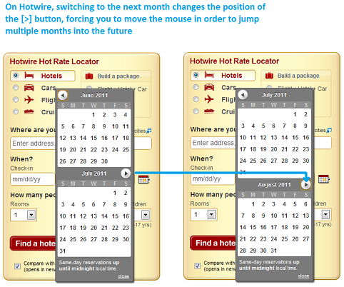
To show you it’s not only Firefox I’m bitching about, here’s another example of not understanding the fifth point. It comes from a service I like and often use: Hotwire. In most cases where you need to choose dates, you get a “month calendar”, and in some cases two horizontally adjacent month calendars. The folks at Hotwire decided they want to layout the month calendars one on top of the other. This in itself is not a bad decision. The problem is in how they implemented the navigation between months. Hotwire placed the “Next Month” button below the topmost month, above the bottom month. So what happens is that for some months, when I click the “Next Month” button, it moves, because the next month has “more lines” in its calendar. So to move ahead 4 months, instead of just clicking 4 times, after each click I need to look at the screen and move the mouse. I truly love Hotwire, but whenever I need to browse between months it drives me crazy. Still worth it though :)
So the bottom line is: think about the fifth point of infinity, think about where the user’s mouse is located after every click, think about whether it’s good or bad, and think about how you can use it to build a better product to make your user’s life smoother and more fun.
— additional remarks
1 That’s unless you have multiple screens. And people with multiple screens know how annoying it is to “hit” the corner from which the screen expands. For example, if you have a screen extension to the right, it’s more difficult to close the current maximized window on the left.
2 In non-Office application the top left corner not very well used, but leads to the “Alt-Space” old window-context-menu, which allows you to minimize/maximize the current windows. Double-clicking the top-left corner closes the window, but that’s redundant because of the top right corner.
3 Before Windows Vista, the [x] button wasn’t exactly on the top right corner, you had to pull your mouse to the top right, and then a little bit back to the center of the screen. I always thought it was to protect users from accidentally clicking it, but I like it better that it’s on the top right.
4 I’m not saying that a design where buttons move around following the mouse cursor is necessarily horrible, I acknowledge that someone somewhere may build a good design based on that, but I find it hard to believe… Anyone want to accept the challenge?
5 In IE it’s not possible (you have to select a tab before you can close it), so I’m leaving IE out of this comparison.


