An insight from Apple on the the real meaning of hiring top people

A couple of weeks ago I had a chance to meet and listen to several very interesting people who came to visit Israel as part of Saul Klein’s “Data, Narrative and Culture” meetup series.

Among them were Allison Johnson, who was the VP of Marketing for Apple, and Chris Riley who was creative director in Allison’s team at Apple.

It was one of the most fascinating presentations I attended in my life, as it included first-hand stories from the people who launched the iPhone and iPad to the world. There were many insights shared by Allison and Chris, but there’s one that stuck with me and won’t let go.

Allison Johnson and Chris Riley, Apple Marketing and Creative

Allison Johnson and Chris Riley

Allison said that in the top areas within Apple, there were no politics. Which sounded strange, even artificial. But then she proceeded. She said that company politics are based on people’s aspiration to advance themselves in the organization and replace others. But at Apple, no one could imagine replacing Johnny Ive. Or replacing Scott Fortsall. Or replacing her.

And that struck me. A truly “top” person is someone who no one can imagine replacing. If you’re an entrepreneur or run a company, you can probably look around you at each of your peers and ask yourself this question. “Can anyone in my company imagine himself replacing that guy/gal?”. Your management team needs to include people for whom the answer is “No”.

Before you raise the cliche that “graveyards are full of indispensable men”, note that the question isn’t “can anyone replace him/her?”, because you’d probably say “No” to that question about every top person you have, and you’d be wrong. The question “can anyone imagine himself replacing him/her” goes deeper into the psyche of an organization, and where the answer is “No”, there you have a person people will follow.

Now we need to find a few more of those.

Posted in General | 4 Comments

What I wouldn’t do to welcome Windows 8 into the world… Hello Metro!

Yes, I would even dismember my beloved old Packard Bell Statesmen!

(This is for a very cool project that’ll be exposed soon…)

So… Hello Metro!


Roee Adler Welcoming Windows 8 - Part 1

Roee Adler Welcoming Windows 8 - Part 2


Roee Adler Welcoming Windows 8 - Part 3


Roee Adler Welcoming Windows 8 - Part 4


Roee Adler Welcoming Windows 8 - Part 5


To summarize: Hello Metro!


Roee


Posted in Experiences, General, Soluto | Leave a comment

The greatest trick Apple ever pulled was making you think it’s YOUR fault


As we (Soluto) move into the Mac world, it became clear to me that I, a proud PC guy, have to become a Mac user for a while in order to be able to get inside the heads of Mac users. So at the risk of letting my soul get sucked into the fanboi dark side, I bought the cheapest MacBook Pro and started working with it as my main machine. There are things I like and there are things I don’t, but the purpose of this post is not to provide a pros/cons chart. It’s to tell a short tale that goes much deeper.


You see, a little while after I started using my new MacBook Pro (as in a few hours after I unboxed it and started using it), its fan started working. And it was loud. Not a clicky-ti-click-somehing’s-stuck-there noisy, but just a higher volume than what I’m used to with my $599 Asus laptop. A day later, when one of our designers sat with me in my very quiet office, the fan went on, she noticed it, and looked at me puzzled. I told her “yeah, apparently MacBooks have a loud fan”. She said “it can’t be right, there must be something wrong with this specific machine. Did you get it tested?” I said “No, I just think it has a loud fan, some machines just do.”


This raised a flag in my brain, so I went to a couple more smart people and told them off-hand that my MacBook has a surprisingly loud fan. The first reacted with “Did you put it in a very warm place? Directly under sunlight?” (the answer: no). The second asked me “what type of heavy analysis did you run on it to make it so loud?” (the answer: I worked on a Google spreadsheet in Safari and nothing else was open).


What’s so amazing about this story is that when people are confronted with a problem in an Apple product, in most cases they assume it’s the user’s fault. Don’t get me wrong, Apple makes the best consumer electronics, it’s a huge innovative force in the world, and in general the guys and gals working there are good for humankind. But their products are not perfect. Almost nothing is. The only perfect product in the history of technology was Microsoft Bob, and it was deprecated  back in the 90s.


I hear many people criticizing Android’s responsiveness etc, but no one criticizing iPhone 3GS’s horrible sluggishness since iOS 4.0. And it is horrible. Sometimes I benchmark my iPhone, to discover that opening the settings app takes 13 seconds. But it’s so unpopular to talk about it, that people who encounter a negative experience with an Apple product just suffer in silence, often assuming it’s their own fault (“I must be running too many apps”, or maybe “I’m holding it wrong“).


Beyond being a peculiar cultural phenomenon, it may be the greatest branding achievement of all time: convincing the world your products are perfect, and whatever’s wrong cannot be your products’ fault.


So to sum up, and to paraphrase on one of my favorite movies, the greatest trick Apple ever pulled was making you think it’s YOUR fault.


Posted in Product Management, Soluto, User Experience | 159 Comments

BCC is evil, and a cry for help to email makers

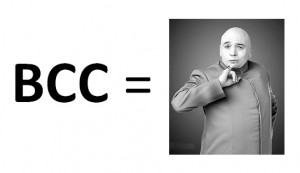
Once upon a time, a long long timBCC is Evile ago, when I was very young, like, 11 years old, I used to sometimes BCC people in emails. For me to use BCC required two conditions to exist:

  1. I sent something to person X, but I also wanted person Y to be aware of me sending the information to X and-
  2. Either one of the following:
    1. It was important to me that X isn’t aware that Y knows about it or-
    2. I thought it wasn’t important that X knows about Y knowing about it, and I didn’t want to add Y to a conversation whereby he’ll start receiving reply-to-alls.

Quite trivial, I know, that’s the purpose of BCC.

When I started working for my previous boss, one of the things he explicitly told me was “never use BCC as long as you work for me, and I recommend that you never use BCC at all, ever”. I thought I was smart, so I asked “is it because sometimes when people are BCCd they reply-to-all, embarrassing the original sender?” – “No”, he said, “it goes much deeper”.

And then he told me something that sticks with me since, one of the smartest things I’ve heard. He said “When someone sends you an email where you’re BCCd, your brain tags that person as someone who sometimes BCCs people in emails. So next time he sends you an email where you’re NOT BCCd, your brain will wonder whether he BCCd anyone on this email that he doesn’t want you to know about. As a consequence, your brain will automatically tag this person as someone who may have something to hide, and you’ll develop a concern for the level of honesty and transparency of that person. With time, you may grow not to trust him. Don’t be that person. If you send someone something and you want me to be aware of that, just forward me the email after you send it, and do that with everyone else.”

Beyond agreeing with his point, what I loved about this analysis is that it was based entirely on the perception of the other side. One of the most important things in product management, in marketing, and in fact in anything, is the ability to put yourself in the other person’s shoes, and be able to imagine his train of thought, both conscious and unconscious. If you’re smart enough, you’ll be able to understand what the major pitfalls in your behavior are, leading that person to think bad thoughts about you (or your product).

So I’ve never used BCC since, I tell this story to all my employees, and I forward many emails after I send them. Which on my iPhone is a huge pain (because of the time it takes the Sent Items folder to sync before I can forward).

Which leads me to the purpose of this post: please consider this a cry for help to all those developing mobile email clients, web email services, desktop email clients, email-related browser plugins, etc:

Please give me the ability to add to each email a list of people to whom the email will be forwarded after it is sent. Want a cool idea? Give me the option to replace BCC with a “forward-after-send” option, so I can use the existing BCC field in the email client, but some plugin or other magic will pull out the BCC and forward the email to each person in the BCC box after the email is sent. But wait! Will such a feature defeat the purpose and make forwarding an email after sending it “the new BCC”? In which case the whole story I told above will start being relevant for forward-after-send as well? I don’t know, we’ll have to try. In the meanwhile, please help. I’m in pain here.


Thank you,

A devout email user


Posted in General | 21 Comments

The Fifth Point of Infinity (Or: Why Firefox Pisses me Off)

Product designers often have the challenge of making it easy, simple and fun for users to use their product. This usually includes moving the mouse over things and clicking them. You may be surprised that for many people the task of moving the mouse to a specific location (e.g. a button) and clicking it is not trivial and may take several seconds.

Common product management knowledge dictates that there are 5 points on the screen that are of infinite size, and are thus infinitely easy to “reach” or click. The first 4 are the 4 corners of the screen – just pull your mouse to one of them, and you’ll surely reach it1. For example, Microsoft uses these 4 points well (at least starting with Windows 7 and Office 2007, and assuming you’re working with a maximized window):

  • Top left: Office button, leading to Save/Print/etc2
  • Top right: close the current maximized window3
  • Bottom right: show desktop
  • Bottom left: Open the “Start Menu”.

But the most interesting and challenging point of infinity is the 5th one, which is where your mouse cursor is currently located. Bringing the choice to the user’s mouse cursor may be the easiest thing of all, but if you don’t use it wisely, you can end up with horrible designs where buttons are chasing the mouse, etc4. The potential of the fifth point is huge, but using it properly is an art. As a product manager/designer, even if you don’t use it, you must be aware of it and constantly ask yourself where the user’s mouse cursor is currently located, whether it’s good or bad, and what you can do about it.

One example that pisses me off with Firefox is their implementation of dynamic-size tab headers. Let me explain. When you open 2-3 tabs in a modern browser, there’s some constant width to the tab headers. But when you open more than what fits the screen width, tab headers begin to shrink, so that more fit in. That’s good design.

In both Chrome and Firefox, you can close any open tab, regardless of whether it’s the tab you’re currently viewing5. To close a tab, you simply click the small [x] on the tab header. The difference starts at what happens next.

Google are executing perfectly here, keeping the same (shrunk) tab sizes, and bringing the [x] button of the next tab to exactly where your mouse cursor is. To close several adjacent tabs, simply click several times – no need to move the mouse. Chrome keeps the tab widths that way as long as your mouse is on the [x] button of the next tab. Once you move the mouse outside the range of the [x] button, the tabs grow to fit the width of the screen.

Google Chrome dynamic tab size upon closure

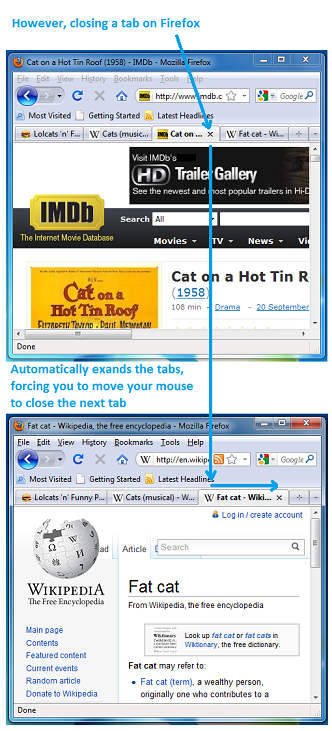
Firefox, on the other hand, acts differently. When you close a tab, the other tabs grow to fill the screen width, moving the [x] button of the next tab slightly to the right of where your mouse cursor is currently located. That’s why closing 5 tabs in Firefox takes 10 times what it takes in Chrome, and the eye-hand coordination required is way more complex.

Firefox dynamic tab size upon closure

To clarify, I’m sure the Chrome dev team did invest in developing and testing this feature, it didn’t come for free. But the reason it happened was because some crazy product manager at Google is a user advocate that understands how to use the fifth point of infinity well, and he got it on the development roadmap. Kudos to him/her.

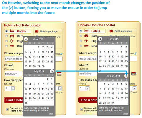
To show you it’s not only Firefox I’m bitching about, here’s another example of not understanding the fifth point. It comes from a service I like and often use: Hotwire. In most cases where you need to choose dates, you get a “month calendar”, and in some cases two horizontally adjacent month calendars. The folks at Hotwire decided they want to layout the month calendars one on top of the other. This in itself is not a bad decision. The problem is in how they implemented the navigation between months. Hotwire placed the “Next Month” button below the topmost month, above the bottom month. So what happens is that for some months, when I click the “Next Month” button, it moves, because the next month has “more lines” in its calendar. So to move ahead 4 months, instead of just clicking 4 times, after each click I need to look at the screen and move the mouse. I truly love Hotwire, but whenever I need to browse between months it drives me crazy. Still worth it though :)

Hotwire month selection annoyance

So the bottom line is: think about the fifth point of infinity, think about where the user’s mouse is located after every click, think about whether it’s good or bad, and think about how you can use it to build a better product to make your user’s life smoother and more fun.


— additional remarks

1 That’s unless you have multiple screens. And people with multiple screens know how annoying it is to “hit” the corner from which the screen expands. For example, if you have a screen extension to the right, it’s more difficult to close the current maximized window on the left.
2 In non-Office application the top left corner not very well used, but leads to the “Alt-Space” old window-context-menu, which allows you to minimize/maximize the current windows. Double-clicking the top-left corner closes the window, but that’s redundant because of the top right corner.
3 Before Windows Vista, the [x] button wasn’t exactly on the top right corner, you had to pull your mouse to the top right, and then a little bit back to the center of the screen. I always thought it was to protect users from accidentally clicking it, but I like it better that it’s on the top right.
4 I’m not saying that a design where buttons move around following the mouse cursor is necessarily horrible, I acknowledge that someone somewhere may build a good design based on that, but I find it hard to believe… Anyone want to accept the challenge?
5 In IE it’s not possible (you have to select a tab before you can close it), so I’m leaving IE out of this comparison.


Posted in General | 4 Comments

Soluto is hiring for two amazing business positions, know anyone relevant?

Hi, I’m looking to hire two very smart people to play leading business, product and marketing roles at Soluto. These are challenging, senior positions requiring experience, creativity, execution and being very smart (did I say that already?). In an attempt to reach as many possible candidates as possible, I’m posting these job specifications and requirements on my personal blog (they were originally posted on the Soluto jobs page). If you think you’re a good fit for one of these jobs, please write me directly at roee@soluto.com, and please share with your friends who you think are relevant. It’s going to be exciting and fun. Thanks, Roee.

Business Development Manager

Specific responsibilities:

  1. Analyzing the channel structure in the SMB IT market, initially in the US
  2. Create channel partnerships
    1. Find channel partnerships that will scale access into many SMBs
    2. Create relationships with these channels
    3. Define the business cooperation and deal structure, negotiate, execute
    4. Accompany the channel throughout the partnership
  3. Sales support
    1. Act as a sales person on first accounts
    2. Including account management of direct accounts
    3. Assist in defining the sales process
  4. Marketing support
    1. Define marketing activities related to recruiting channels and retaining them
    2. Take part on those marketing activities (e.g. conferences)

Requirements:

  1. Be VERY smart, understand how people and businesses think
  2. People’s person, nice, not sleazy
  3. Be creative, we’re inventing stuff here, part of it is novel business concepts
  4. Hard worker, an executing person, even when mundane and “no fun” tasks are required
  5. Self-managing, self-organized, smart about priorities and when to raise flags
  6. Experience in customer-facing or partner-facing jobs with US customers or partners
  7. Experience in the IT world
  8. Experience working with PCs, preferably a person who supports his family’s PCs
  9. Work from Tel Aviv
  10. Ability to travel 40% of the time
  11. Plus: engineering background
  12. Plus: MBA
  13. Plus: native English speaker

Product Marketing Manager

The product marketing manager’s responsibilities:

  1. Research customer segments
    1. What are the segments, what are their needs and pains
    2. How they take buying decisions, what they pay for today, their budgeting, etc
  2. Research product competitors
    1. Who are they, what are their strengths and weaknesses
    2. Where they succeed, how and why
  3. Understanding the customer, generating market requirements
    1. Understand *in detail* the problems and needs of target customers
    2. Talk to them, invent ways to provide them with huge value
    3. Define what are the product goals
    4. Write MRDs, including personas, pains, requirements, etc
  4. Pricing:
    1. What prices does the market currently pay, for what
    2. What’s the competition’s pricing and why
    3. How should we price our products
  5. Product specs
    1. Understand *in detail* the features required by customers & offered by competition
    2. Define feature sets required from us, in different levels of priority, and in order to achieve different goals
    3. Write detailed feature specs
  6. Sales and business development support
    1. Help the business development and sales functions in understanding the customer
    2. Create sales tools, presentations, etc
  7. Marketing support
    1. Feed the marketing with ideas on how to better attract potential customers

Requirements:

  1. Be VERY smart, understand how people and businesses think
  2. People’s person, customer facing, team player
  3. Be creative, we’re inventing stuff here
  4. Hard worker, an executing person, even when mundane and “no fun” tasks are required
  5. Self-managing, self-organized, smart about priorities and when to raise flags
  6. Experience in the IT world, understand PCs, networks, etc
  7. A person who supports his friends’ and family’s PCs
  8. Work from Tel Aviv
  9. Excellent English, preferably native speaker
  10. Ability to travel 25% of the time
  11. Plus: experience in product management
  12. Plus: experience in international customer-facing or partner-facing jobs
  13. Plus: experience in market research
  14. Plus: engineering background
  15. Plus: MBA


Posted in Soluto | 2 Comments

A birthday summary of the passing year

Today I’m 32. In some ways it sounds very old to me, and other ways very young. The passing year may have been the most important one in my life so far, both personally and professionally. To recap what happened in the passing year:

  1. I became a dad to beautiful Gali
  2. Soluto turned from a stealth start-up to the winner of TechCrunch Disrupt

There were many other things, but these two shine in comparison. May the next year be as eventful as this one, but this time with more peace and quiet. Or not :)

Yours,

Roee

Posted in General | 2 Comments

Product Basics – Some Learn Your Product, Others Don’t (or: a Twitter #Fail story)

Conan Pale Whale by Yiying Lu

Products should be self explanatory. Some products are naturally more complex than others (e.g. trucks vs. beer-cans), but every product should aspire to be usable out-of-the-box without requiring the user to read any manual. For complex products it’s a real challenge (sometimes unrealistic), and for trivial products it’s, well, trivial.

When your product is in its very early stages, especially if you’re doing something truly novel, your users invest time in learning your product. This “learning” process may include reading texts, watching a short clip, or better yet staring at your UI for 15 seconds, and then getting it.

This learning curve happens in real life because of the following reasons:

  1. You created something new, so people need a bit of time to get adjusted to it.
  2. The type of people who use early-stage products are innovators wishing to feel they understand the new stuff, and feel their time would be best utilized by deeply understanding your product. This knowledge is what differentiates them (in their own minds) from the rest of the population. They know, they understand, they get it.

What a great alignment, your users will help you adjust to real life.

But as you advance from the early users to the larger majority, the attention span for learning your product decreases, and as you become more and more popular your new users just don’t spend time learning – they start using.

I’m usually a late-adopter, such was the case for me with Twitter, iPhone and many other products/services. I want to show you that even a company such as Twitter, with great product management in my opinion, can suffer from this syndrome. And I’m talking about Twitter’s “reply” feature.

In the early days of Twitter, long before I became a user, I remember seeing Conan joking that in order to use Twitter you need to learn a whole new cryptic language (showing a bunch of tweets with @s and #s). This wasn’t far from the truth – for example, you had to understand that in order address someone you need a “@” before their username. Also, as an early user, you probably learned that if you start a tweet with “@somename”, then no one will see this tweet in their feed unless they follow both you and @somename. This type of tweet (one that starts with @somename) was called a “reply” (here’s Twitter’s description of this feature).

By the time I joined Twitter, I had no capacity to “learn it” and just started using it. After watching a bunch of tweets, it was clear that to address a twitter user I had to use “@” and then his Twitter username. But I didn’t know about this “reply” feature, and indeed made the mistake of trying to joke on the expense of someone with a tweet like “@herschel is such a moron, like, seriously!”. Since most of my friends weren’t following @herschel, almost no one saw that tweet but @herschel. This type of problem is extremely severe, because I myself had no idea that no one saw it, nor did I have any reasonable method of finding it out. From my perspective, such a “reply” looks the same as any other tweet.

About a year (!) after I started using Twitter, a friend of mine who was an early adopter of Twitter told me about a certain tweet that he thinks I shouldn’t have made a “reply” but a public message, because it was funny (“add a dot” he said, I had no idea what he was talking about). It took the both of us a couple of minutes to figure out that it was obvious to him that I know what a “reply” is, whereas I had no idea that there’s anything special with a tweet starting with “@somename”.

Now you may think I’m a complete idiot, so did I. So I started asking people around me if they knew about this feature, and almost no one did. One extreme example was a certain blog that covered Soluto, and tweeted their story in the following way “@Soluto is a great application for X and Y”. So it wasn’t just me.. I wrote the blogger and told him about Twitter’s “reply” feature and he replaced the tweet with one not starting with “@Soluto”. By the way, “adding a dot” means adding a “.” character before “@somename”, so the tweet does not start with “@” and hence is not considered a reply. For example, say you wish to tell the world that “@Soluto is great!”, what you should tweet is “.@Soluto is great!”.

After I understood the “reply” feature on Twitter, I thought it makes a lot of sense, and I see why it’s needed. But nevertheless there’s a problem among users: for some of them, some of their tweets go out with no one there to see them, and they have no clue about it.

This is a classic case of a product expecting people to learn how to use it.

I consider myself a non-whiner, that’s why when I pass judgment I always try to put myself in the shoes of the one I’m judging. In the “reply” case, I really don’t know how I would solve it cleanly if I was in charge of Twitter’s product (and I will say this again: I think they have a superb product from a product-management perspective). There are a bunch of options, but neither is clean. One of the most important things in product management is to “throw ideas out there”, even if they suck, just to generate (or even inflame) a discussion. So here are a couple of ideas:

  1. If the person I’m replying to has significant followship, e.g. > 10k followers, treat the reply as a public tweet.
  2. If over a certain percentage of my followers also follow the person I’m “replying” to, treat the reply as a public tweet.
  3. In my first few tweets, when I start a tweet with “@”, a message will appear explaining to me in very few words that this tweet will not be easily visible to my followers who do not follow this guy (it won’t be a blocking message requiring me to press “Ok”, but rather a levitating “hint” that does not required interaction).
  4. Do YOU have any ideas?

So to summarize, it’s ok to expect your early adopters to spend a bit of time learning your product, but the days of telling users to RTFM are gone. When designing for the masses, assume people won’t spend a second learning, and will just start using. Design accordingly.

Posted in General | 15 Comments

The art of using few words

Crime Scene Do Not Cross TapeAt Soluto we spend a lot of time perfecting the user experience. When you build a solution for a complex problem like we do, quite often you want to convey a complex message to the user (with words). But you can’t. The reason is that users aren’t interested in complex messages and automatically filter them out. The best (and most common) examples for this are dialog boxes asking the user a complex and long question and offering Yes/No buttons. People don’t read text, it’s a fact, get used to it and design around it.

Another common issue around product texts is what I call “assholish disclaimers”. An assholish disclaimer is a description you know users won’t read, but you put it there just so you could say “Aha! If you’ve read the text, you’d have known the answer!” – in an assholish, Cartman-ish voice. I hate assholish disclaimers because they circumvent creative thinking by offering an easy-but-ugly way out for product managers, and because it’s a phenomenon that leads to longer texts in products all around the world.

Using few words on iPhone or Android applications is trivial because you have no other option (and still the iTunes terms of service are 46 pages you need to “read” before you approve every time time they change). But it’s less trivial in applications running on screens larger than 6″…

At Soluto we really try to get it right, so whenever we have a non-trivial message to convey, we use the following algorithm:

  1. Don’t use any text, only graphics/animation.
  2. Once you’ve failed, write down the message you would like to convey.
  3. Now express this message with 2 words.
  4. If you failed, try to express the message with 3 words.
  5. If you failed, try to express the message with 4 words.
  6. Now stop counting words with two or less letters (a/an/is/if/on/in/to/be/…).
  7. If you failed, sleep on it, or move to the next challenge and get back to this one later. There cannot be more than 4 words. Well, rarely we can accept 5 words, but that’s the absolute limit.

Getting this right is a real pain, and sadly it’s part of my job to come up with these text fragments. Gladly I do other things too… :)

Sometimes, you’re allowed to use non-perfect English to accomplish this “few words” goal. Two notable real-life examples are:

No Children This Row

  1. No Children This Row (in every exit-row in every commercial airplane)
  2. Crime Scene Do Not Cross (in every yellow tape around every triple-homicide scene)

These two examples are the lighthouse for every product manager that has to phrase something, especially “No Children This Row”, which is completely broken English but perfectly conveys the message it was intended for.

Let’s deep-dive into one Soluto example.

When we drafted the design for our boot feature (around the 62nd iteration), we split the applications loading in boot to 3 categories: Green, Orange and Gray. For each category we decided we’ll give a name and a very short sub-title.

  1. Green: this category contains items our analysts recommended you remove from your boot, regardless of how you use your PC. We want every user to understand these items and remove them. The name we chose was “No-Brainer”, and the sub-title was “Remove from boot”.
  2. Orange: this category contains two types of items. The first is items that our analysts think some users need and others don’t, and it depends on the user’s choice. The other type is items our analysts didn’t get to yet, but can technically be removed. It’s dangerous for novice users to play around in this category, but experts want access to it and will probably remove a bunch of these. The name we chose was “Potentially Removable”, and the sub-title: “Advanced users”.
  3. Gray: here we have three types of items. First, there are items our analysts think must be in your boot, even if they can technically be removed (e.g. anti-virus, some Windows services). Second, there are core OS components that cannot be removed from the boot (e.g. lsass.exe). Third, we have Soluto itself, that takes time in the boot, and cannot be removed from within Soluto (users can obviously uninstall it like any other program). There were actually a lot of deliberations around the inclusion of Soluto in this group, but it’s outside the scope of this post. Novice users usually have nothing to look for in this group except for understanding how long it takes in the aggregate (as % of the total boot). Experts want to understand the breakdown. The initial name we chose for this group was “Required” (one word, woohoo!), and the sub-title was “Cannot be removed”.

As you can see, all names and all sub-titles were under 4 words. We did make a mistake of putting “advanced users” in brackets and the others after a hyphen – it made sense but in retrospect was wrong.

So it all seemed good, but there was a serious problem with “Required” and “Cannot be removed”. The obvious upside was that it’s one word. The downside was that it wasn’t accurate. This is a common trade-off when using few words. Even though it passed our in-house UX testing (around 30 people saw it), we received complaints from many users.

The complaints were a combination of 1) not understanding what the categories are and; 2) not agreeing with our categorization of specific applications (and a mix of the two).

These were the key points:

  1. Some Windows services aren’t required and can be removed, why are you putting it the Gray category? (answer: because we at Soluto want to protect users from making PC-breaking mistakes)
  2. The anti-virus is not required, and it can be removed, why is it there? (answer: same as 1)
  3. Soluto is not Required, why are you putting it there? So we think it cannot be removed? (answer: on the one hand we want to be transparent about how long Soluto takes in the boot, but on the other hand, because of how Soluto works, you cannot remove it from boot and still have Soluto).

We considered several options, and finally reached the following: we highlighted Soluto’s part in the boot (light blue), and changed the name of the Gray category to “Cannot be removed with Soluto”, with the sub-title “yet…”.

It wasn’t trivial for us to take this path, because there are many words there. “with Soluto” adds tons of text, and although it helps make things more accurate, there’s a good chance most users will “read through” these words, seeing only “cannot be removed”. Is it an assholish disclaimer? There’s a slight chance it’ll be perceived as such, but I think that most probably it’ll be ok. So in this case the combination of “yet…” and “Cannot be removed with Soluto” works, although not perfectly.

That’s the point in saying things with few words: it’s difficult to nail it perfectly, but it’s better than an accurate description that no one reads.

Posted in General, Product Management, Soluto | 14 Comments

Soluto Looking for a Designer, and Jobs Sucks

Today we published that we’re looking for another ultra-talented designer for our user-experience team. Hiring for this team is managed directly by Omer Hagai, our UX lead. This is different from the usual hiring, that is directly managed by Ishay Green, our co-founder and CTO.

So, to put things in order, we created a separate email address for jobs in the UX team. We naturally called it JobsUX@soluto.com.

Surprise surprise, it appears yet again that not thinking through things may result in them coming back to bite you in the arse. A wave of laughs came back at us thinking that either the “job sucks”, or that we’re trying to hide a joke that “Jobs Sucks”, i.e. Steve Jobs, i.e. the devil. Just kidding. It’s not and we’re not – the job is amazing and Steve Jobs makes great products.

This gave me an excuse to post this here: we’re looking for an amazing designer, who has designed smart user experiences, who knows the ins and outs of Freehand, Illustrator & Photoshop, and preferably with experience using Expression Blend.

Location: Tel Aviv.

Contact: jobsux@soluto.com :)

Posted in General | Leave a comment