 At Soluto we spend a lot of time perfecting the user experience. When you build a solution for a complex problem like we do, quite often you want to convey a complex message to the user (with words). But you can’t. The reason is that users aren’t interested in complex messages and automatically filter them out. The best (and most common) examples for this are dialog boxes asking the user a complex and long question and offering Yes/No buttons. People don’t read text, it’s a fact, get used to it and design around it.
Another common issue around product texts is what I call “assholish disclaimers”. An assholish disclaimer is a description you know users won’t read, but you put it there just so you could say “Aha! If you’ve read the text, you’d have known the answer!” – in an assholish, Cartman-ish voice. I hate assholish disclaimers because they circumvent creative thinking by offering an easy-but-ugly way out for product managers, and because it’s a phenomenon that leads to longer texts in products all around the world.
Using few words on iPhone or Android applications is trivial because you have no other option (and still the iTunes terms of service are 46 pages you need to “read” before you approve every time time they change). But it’s less trivial in applications running on screens larger than 6″…
At Soluto we really try to get it right, so whenever we have a non-trivial message to convey, we use the following algorithm:
- Don’t use any text, only graphics/animation.
- Once you’ve failed, write down the message you would like to convey.
- Now express this message with 2 words.
- If you failed, try to express the message with 3 words.
- If you failed, try to express the message with 4 words.
- Now stop counting words with two or less letters (a/an/is/if/on/in/to/be/…).
- If you failed, sleep on it, or move to the next challenge and get back to this one later. There cannot be more than 4 words. Well, rarely we can accept 5 words, but that’s the absolute limit.
Getting this right is a real pain, and sadly it’s part of my job to come up with these text fragments. Gladly I do other things too… :)
Sometimes, you’re allowed to use non-perfect English to accomplish this “few words” goal. Two notable real-life examples are:

- No Children This Row (in every exit-row in every commercial airplane)
- Crime Scene Do Not Cross (in every yellow tape around every triple-homicide scene)
These two examples are the lighthouse for every product manager that has to phrase something, especially “No Children This Row”, which is completely broken English but perfectly conveys the message it was intended for.
Let’s deep-dive into one Soluto example.
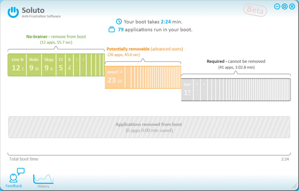
When we drafted the design for our boot feature (around the 62nd iteration), we split the applications loading in boot to 3 categories: Green, Orange and Gray. For each category we decided we’ll give a name and a very short sub-title.
- Green: this category contains items our analysts recommended you remove from your boot, regardless of how you use your PC. We want every user to understand these items and remove them. The name we chose was “No-Brainer”, and the sub-title was “Remove from boot”.
- Orange: this category contains two types of items. The first is items that our analysts think some users need and others don’t, and it depends on the user’s choice. The other type is items our analysts didn’t get to yet, but can technically be removed. It’s dangerous for novice users to play around in this category, but experts want access to it and will probably remove a bunch of these. The name we chose was “Potentially Removable”, and the sub-title: “Advanced users”.
- Gray: here we have three types of items. First, there are items our analysts think must be in your boot, even if they can technically be removed (e.g. anti-virus, some Windows services). Second, there are core OS components that cannot be removed from the boot (e.g. lsass.exe). Third, we have Soluto itself, that takes time in the boot, and cannot be removed from within Soluto (users can obviously uninstall it like any other program). There were actually a lot of deliberations around the inclusion of Soluto in this group, but it’s outside the scope of this post. Novice users usually have nothing to look for in this group except for understanding how long it takes in the aggregate (as % of the total boot). Experts want to understand the breakdown. The initial name we chose for this group was “Required” (one word, woohoo!), and the sub-title was “Cannot be removed”.
 As you can see, all names and all sub-titles were under 4 words. We did make a mistake of putting “advanced users” in brackets and the others after a hyphen – it made sense but in retrospect was wrong.
So it all seemed good, but there was a serious problem with “Required” and “Cannot be removed”. The obvious upside was that it’s one word. The downside was that it wasn’t accurate. This is a common trade-off when using few words. Even though it passed our in-house UX testing (around 30 people saw it), we received complaints from many users.
The complaints were a combination of 1) not understanding what the categories are and; 2) not agreeing with our categorization of specific applications (and a mix of the two).
These were the key points:
- Some Windows services aren’t required and can be removed, why are you putting it the Gray category? (answer: because we at Soluto want to protect users from making PC-breaking mistakes)
- The anti-virus is not required, and it can be removed, why is it there? (answer: same as 1)
- Soluto is not Required, why are you putting it there? So we think it cannot be removed? (answer: on the one hand we want to be transparent about how long Soluto takes in the boot, but on the other hand, because of how Soluto works, you cannot remove it from boot and still have Soluto).
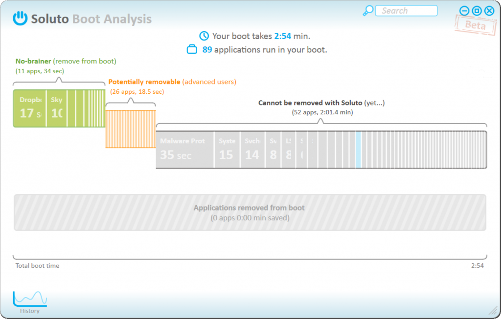
We considered several options, and finally reached the following: we highlighted Soluto’s part in the boot (light blue), and changed the name of the Gray category to “Cannot be removed with Soluto”, with the sub-title “yet…”.
It wasn’t trivial for us to take this path, because there are many words there. “with Soluto” adds tons of text, and although it helps make things more accurate, there’s a good chance most users will “read through” these words, seeing only “cannot be removed”. Is it an assholish disclaimer? There’s a slight chance it’ll be perceived as such, but I think that most probably it’ll be ok. So in this case the combination of “yet…” and “Cannot be removed with Soluto” works, although not perfectly.
That’s the point in saying things with few words: it’s difficult to nail it perfectly, but it’s better than an accurate description that no one reads.


Pingback: Tweets that mention Product Basics – Saying Things with Few Words | Roee Adler's Clown College (aka Blog) -- Topsy.com()